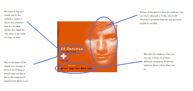
As we can see from the advertisement there isn't much we can say about the location. He has chosen not to show us a location in the advertisement because he could have wanted to keep it simple so that the audience didn't have to think about the message or meaning behind it. It also allows him to have this orange filter over the advertisement, Ed Sheeran is known for being ginger and he has chosen to embrace this and has made it the main colour of his album and the advertisement to go with it.

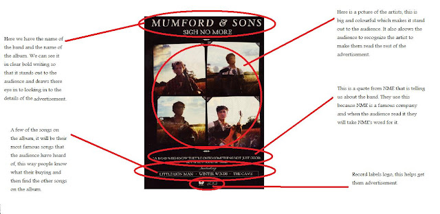
In this album cover we have been give a location, the genre for this album is country, folk rock, which is told to us by the location used. It seems like they are standing in a farm or a field which would reinforces the idea that their genre is folk rock as as the audience we would think of a farm or a field when we think of locations for folk music.

No comments:
Post a Comment